Authoring Reports
Using the Designer
To design a report in Infomaptic, simply drag Template Items onto the design surface. For a review of how that works check out our getting started guide.
One on the design surface, items can be dragged around or resized by grabbing the corners of the items and dragging them.
When working with very small items, it may be useful to disable the edit menu that appears when you hover your mouse over item and item. To do this hold down the Alt key.
You can also double click on any item to open its edit dialog (even while holding down the Alt key).
Holding down Alt and Shift and double clicking an item will prompt you to delete the item.
Custom CSS
Infomaptic allows you to apply custom CSS to items, or to apply custom css to the page. To create a CSS class, use the Info Panel to access the Custom Css text box. Within this box you may implement CSS that will be injected into the final HTML page.
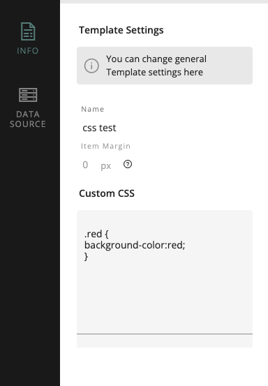
To create a custom class simply use standard CSS to define the class. For example, to make a class that sets the background color to red, use:
.red {
    background-color: red;
}
These custom classes are then available in the edit item dialog to apply via the custom css dropdown.
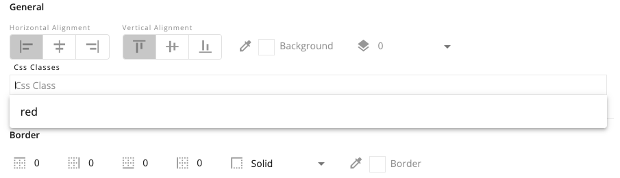
These classes are applied at the item level, not the grid level (see the next section for details).
HTML Structure for an Item
Infomaptic reports use an HTML Grid to generate the layout. Each item consists of a parent item that is positioned within the grid, and one or more child items to contain the information:
<div class="dyRpt-GridCell" style="grid-column : 5 / span 20; grid-row : 9 / span 8; display : flex; justify-content : flex-start; align-items : flex-start; ">
    <div class="dyRpt-ReportItem dyRpt-Expression dyRpt-DisplayLabel red" style="font-size:14px;font-family:Verdana;">
        Freeform Text Value
    </div>
</div>
The outer element always contains the class dyRpt-GridCell while the inner element will have a variety of classes, but will always begin with dyRpt-ReportItem. This level is where custom CSS classes are attached. In this example, the red class is a custom class defined in the Infomaptic UI.
Existing Classes
You may also add default styles to any of the classes automatically appended to items generated by infomaptic. The following classes are automatically appended to all appropriate items.
dyRpt-GridCell- Assigned to a parent div for each item. This div is positioned within the griddyRpt-ReportItem- Assigned to each item. Indicates that the div is a report item of some type.dyRpt-Expression- Indicates that the item is of type Expression. (this is true for labels, field names and values)dyRpt-DisplayLabelIndicates that the item is a Label.dyRpt-DisplayFieldName- Indicates that the item is a field name.dyRpt-DisplayFieldValue- Indicates that the item is a field value.dyRpt-DisplayExpression- Indicates that the item is an Expression.dyRpt-Image- Indicates that the item is an image. This will contain a child<img>tag. (also applies to a map)dyRpt-Table- Indicates that the item is a table. This class is also applied to the child<table>tag.dyRpt-CardHolder- Indicates that the item contains a child grid layout used for things like attachments.
Examples
To style a table with a header color:
- Create a custom class called
custom-tablethat applies the styles to different sections of the table:
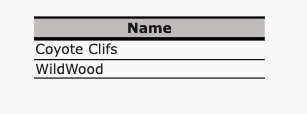
.custom-table table thead tr{
    background-color: #c1baba;
    border-bottom: 3px solid black;
    border-top: 2px solid black;
}
.custom-table table tbody tr{
    border-bottom: 1px solid black;
}
-
Apply that class,
custom-tableto the table item.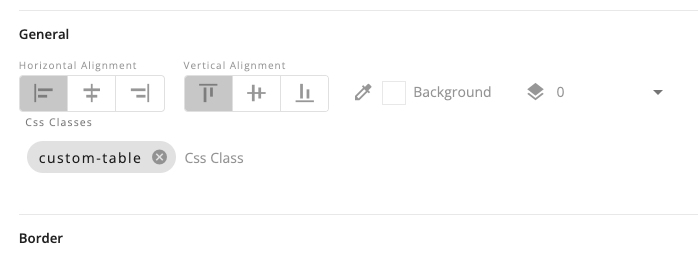
-
Example Output:
Z-Index
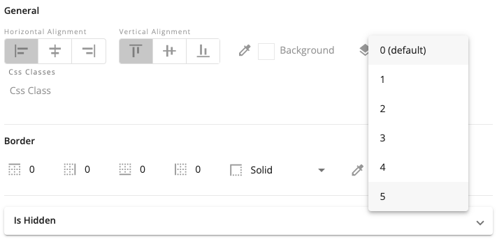
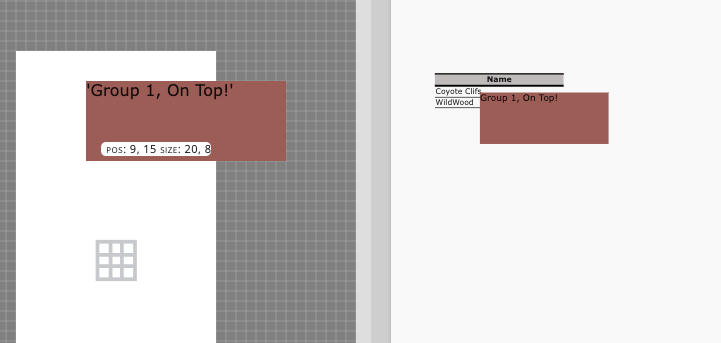
Infomaptic supports using pre-defined layers to control the vertical position of items. By default, all items are in group 0 and so can not overlap.
To move an item to a different group, edit it’s properties and select a higher group (0 is the bottom, 5 is the top).
Once in a different group, the item may stack above any item in a group less than it’s selected group:
ArcGIS Items
When you create a template with Infomaptic it is stored as an ArcGIS Item. For details on these items see Template Storage and Permissions.